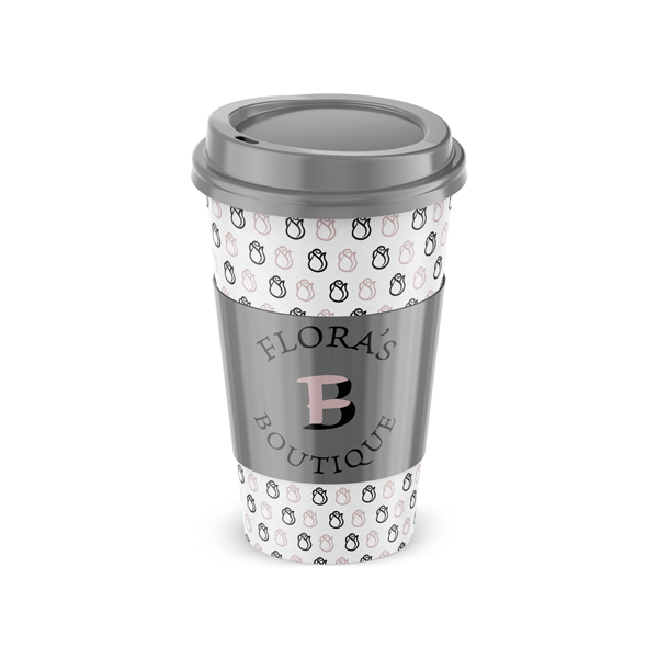
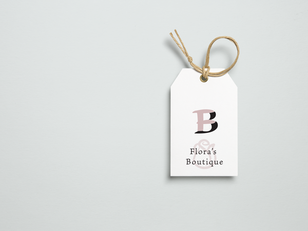
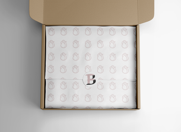
Flora's Boutique was a student project. I started by sketching numerous ideas on paper and narrowed it down to the 3 that were sharpest. They were then masterfully created in a digital version and circulated for input among the key demographic. We chose pink to highlight the femininity of the brand, and paired it with black to connote the stability of the company as a force to be reckoned with. All in all, it resulted in a well rounded brand package that included a variety of logos, patterns, and icons.

